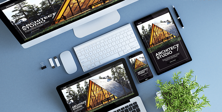
Like many other aspects of your business, you need to take the time to plan the structure and design of a website. Your site needs to be consistent in its design, this includes typography, imagery and colours used. Your website needs to reflect the business and ultimately the brand.
Before you begin to design or redesign your website, think about websites you like to use yourself. What aspects of the website do you like? While each of us will have a different idea of what makes a perfect website in terms of certain aesthetics, I’m sure we can all agree on several things:
- The site is easy to navigate
- The site loads quite quickly
- The site answers the question to the search query
When you are designing your website, you need to concentrate on usability. The following 10 tips are ways to make your website great.
Create a clear site hierarchy
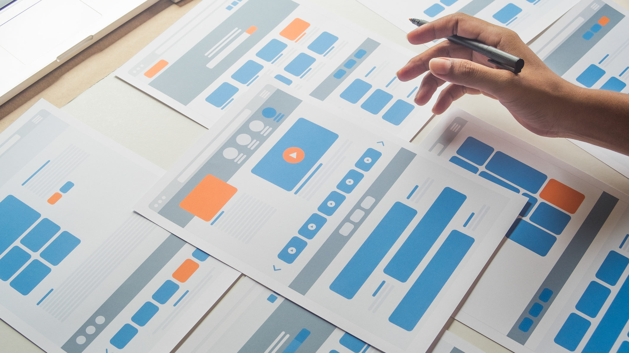
To ensure your site runs well, you should create a site map with a hierarchy structure. Starting at the very top, you need your “home page.” The next level could include things such as “about us,” “services,” and “blog.” The next level could be offshoots of the above suggested so “about us” could contain “locations,” or services could cover a list of services you offer; so, we offer several services such as “social media marketing,” “SEO,” “website design” to name but a few.
Collate a library of assets for the website’s design
Good imagery has the potential to grab a user’s attention as well as trigger emotional responses. You should ensure you use high-quality images across your site. If you’re locating images via other methods, then you should always check the image license first.
The next thing you want to consider is colour. What colours do you already have in your logo, and can they be incorporated on the website? You can also include other forms of media on your site including video and audio, just make sure that they are not blurred, and that compression does not interfere with the load time. And leading onto the next area of website design, images and videos are great for SEO.
Remember that you do not want your design cluttered. Not only will this increase page load time but it’s likely that people will quickly lose interest, creating a spike in bounce rate. When it comes to design, white space is your friend.
Incorporate basic SEO
Taking the time to understand the basics of SEO will be crucial to ensure your webpages are optimised.
- Use meta titles and descriptions for every page. Your title should be a maximum of 60 characters and your meta description a maximum of 160 characters.
- Use ALT tags on all images. This is not just for SEO, but for accessibility. ALT tags let a user know what an image contains if they are visually impaired.
- Use keywords in your titles, content, and links.
Ensure accessibility across your website
A website cannot be genuinely great if someone cannot use it. Consider the following for appropriate accessible design:
- Colour contrast is on all text, images, and buttons. W3 explains more about colour contrast in this video.
- Text size – Minimum 14pt text.
- ALT text – allows a visually impaired person to know what an image contains.
- Screen reader usability – Make sure your text is not in all caps. A screen reader may not be able to read the words correctly and could read each letter individually.
- Can your site be navigated without a mouse? – Some users cannot use a mouse and would use the keyboard. When navigating with a keyboard, you need to ensure that the elements follow a logical process.
Have a clear call to action
Include simple actions on each page that can help grow your business and guide a user. Simple call-to-action buttons or forms to fill in are just two examples of things you can include. Your call to action can be on a static page, or you could even include a pop-up with a time-sensitive offer. The key thing with any call-to-action is that you want the process to be simple and benefit the user.
You should aim for your website to have between 0-4 seconds load time and ideally 0-2 seconds. There are several things you can do to improve site speed:
- Use an image compressor to ensure images files are smaller.
- Reduce the number of plug-ins your website has.
- Use Google PageSpeed to perform a speed test and then follow through on the recommendations it gives you.
- Reduce unused JavaScript and CSS.
Ensure your website is mobile-friendly
Mobile-friendly design means that any aspect of your website is easily accessible across all platforms; laptops, desktops, and smaller screens such as tablets and mobile phones. Google expects your website to be optimised for mobile these days. It will penalise your website if it is not mobile-optimised.
Make your website easy to navigate
This includes using appropriate headers, and a breadcrumb trail to be able to go back a page if needs be. Your header menu on the top of the page should include the important headers in your site structure. Remember to include a search function too!
Regularly check for page errors
We have all had the dreaded 404 error when searching for something online. You can use Google Search Console to find your 404 errors. You can also build a custom 404 error page which can help your customer get back to the navigation. Ensure that there are no incorrectly typed URLs that are creating the 404, and if possible, create redirects to related content.
Visibility of contact information and location
Nobody will want to spend ages looking for something, if a user can’t find what they are looking for, they will leave. Ensure that on your site, your contact and business locations are visible. If you have multiple locations, it’s a good idea to create a separate page for each location, making it easier for customers to go straight to the information that’s relevant to them.
When someone comes to your website, they don’t want to spend ages looking for how to do something. Stick with a simplistic design that is on-brand and easy to use. This relates to user experience (UX) and design principles. Consider how easy it is to navigate your site. Does it have a search bar and is that functionality working properly?
By working to ensure you fix these issues on your site, you are minimising the risk of a customer going to a competitor for goods and services.
Are you looking for help with website design or maintenance? Our team of digital marketing experts can help you develop your website and optimise your content to increase your leads and drive conversion. Contact us today!







I once taught website design in TAFE and was interested to read your article that will be useful for those intending to build a site.
Thanks Robin! That’s wonderful to hear that our resources have been useful to you.